Logo Platform
logo amplifiers simplified
Frogsquadron

Frogsquadron

8 years ago Mar 22,2017, 17:01:56 PM

Riftborn Update - Focus on changes around the battle!

Reply
4 284 Views
22 Comments

Hi everyone!


Just one more day before you get access to Update 3 - the Riftborn Update. Let's cover the changes surrounding the Space Battle, mostly adding feedback and signs to help players understand what goes on in a battle, its resolution, and how to improve your strategy. There's quite a bit of ground to cover, so saddle up!


SHIP DESIGN


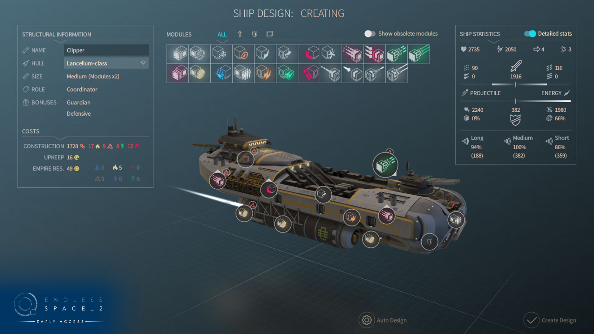
Our main objective here was to display information that was either not displayed or opaque altogether (DPS totals per range and weapon, shield absorption, range compatibility, etc.). You'll get a tooltip if you mouse over these icons. We've added a ratio of energy weapons/projectile weapons for weapons and defenses. This feedback will be on ship & fleet tooltips, as well as on the enemy so you can select the optimal strategy. Moreover, you can open the ship screen from anywhere double clicking a ship icon, a welcome time saver!
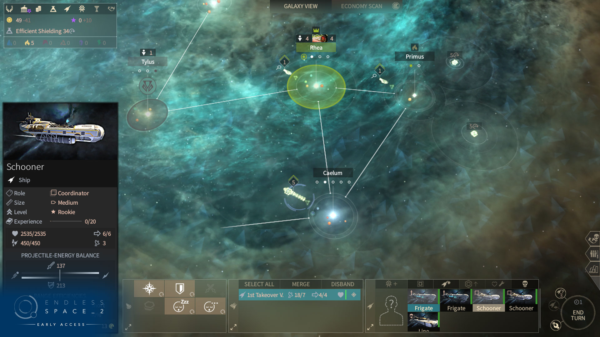


This screen's UI has been overhauled to stay streamlined while offering all this information (along with toggles to hide some). Note that you can now slide modules from slot to slot.


Module icons have been redone to be more consistent with the rest of the game, and to improve the feeling of progression. Protip: weapons and defenses are facing different directions according to type.


From a gameplay side, we leveled multipliers and costs. All modules are now double on Medium ships, and quadrupled on Large ships. "Symmetrical" modules only shoot from one side at a time to reduce disparity during fights (that players couldn't control), but their price has been halved. These changes simplify slot display.


We added a Ship auto upgrade button in the Military Screen, just under the Ship Designs frame where the other ship design buttons are located. When you select a ship design a click on the Auto Upgrade button, all the modules contained in the design will be upgraded to their latest version. This will not fill empty slots in your design, nor will it remove any module or replace them with another kind of module.
No more checking every module and replacing them manually to load your latest toys on board!


DECK NAME CHANGE


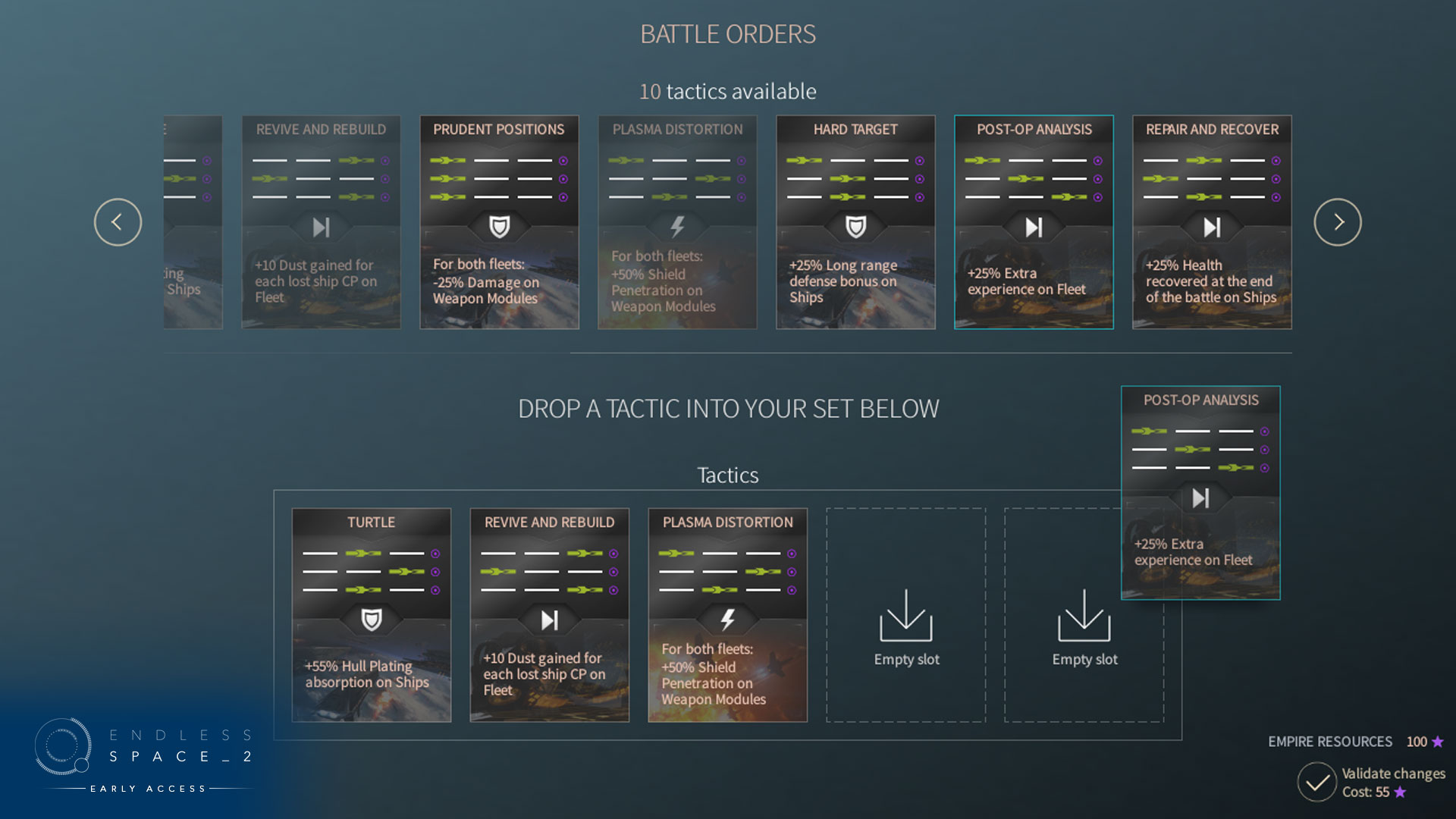
As you suggested, we renamed cards/plays and the deck to terms more fitting with the battle theme, namely tactics & tactics set. Tactics have received tooltips so as to specify their effects and offer some strategic advice. You may now open the tactics set panel in the military screen even when a battle is underway.


ADVANCED BATTLE SCREEN


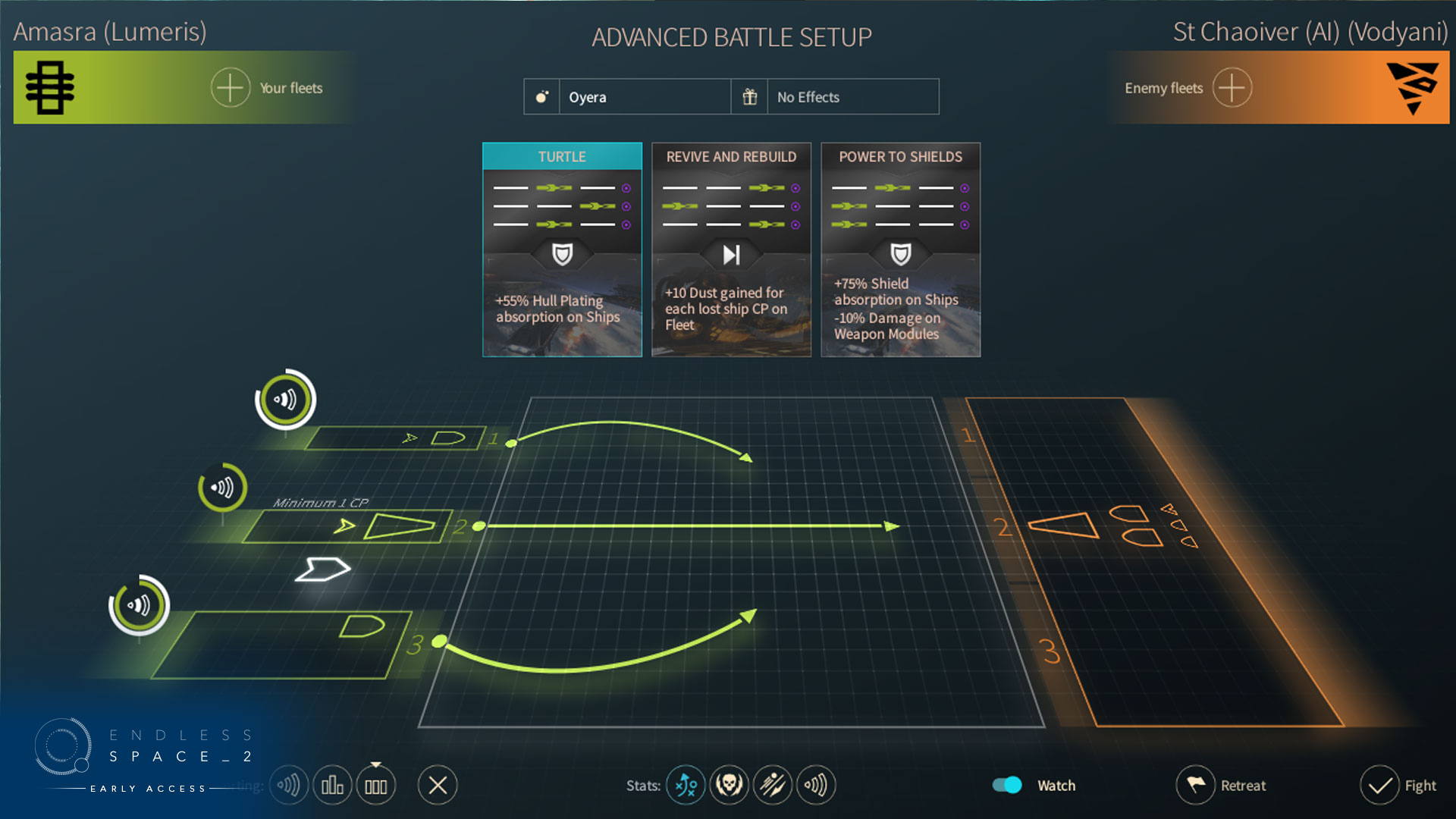
We polished this screen by displaying trajectories and stats to avoid any confusion. We have specified the amount of Command Points necessary to unlock a flotilla. To draw the player's attention to the possibility of redistributing ships among flotillas, we increased visual feedback on mouseover: don't forget you can manually select a ship's flotilla, but also double click on a ship to lock/unlock in on a flotilla. Finally, when moving a ship, you will see a feedback appear on flotilla ranges to show their compatibility.


DURING BATTLE


We improved display of information given by the scan view, in particular when it comes to trajectories and damage templates: a pulsating visual feedback will ensure you are aware of the direction damage is going in!
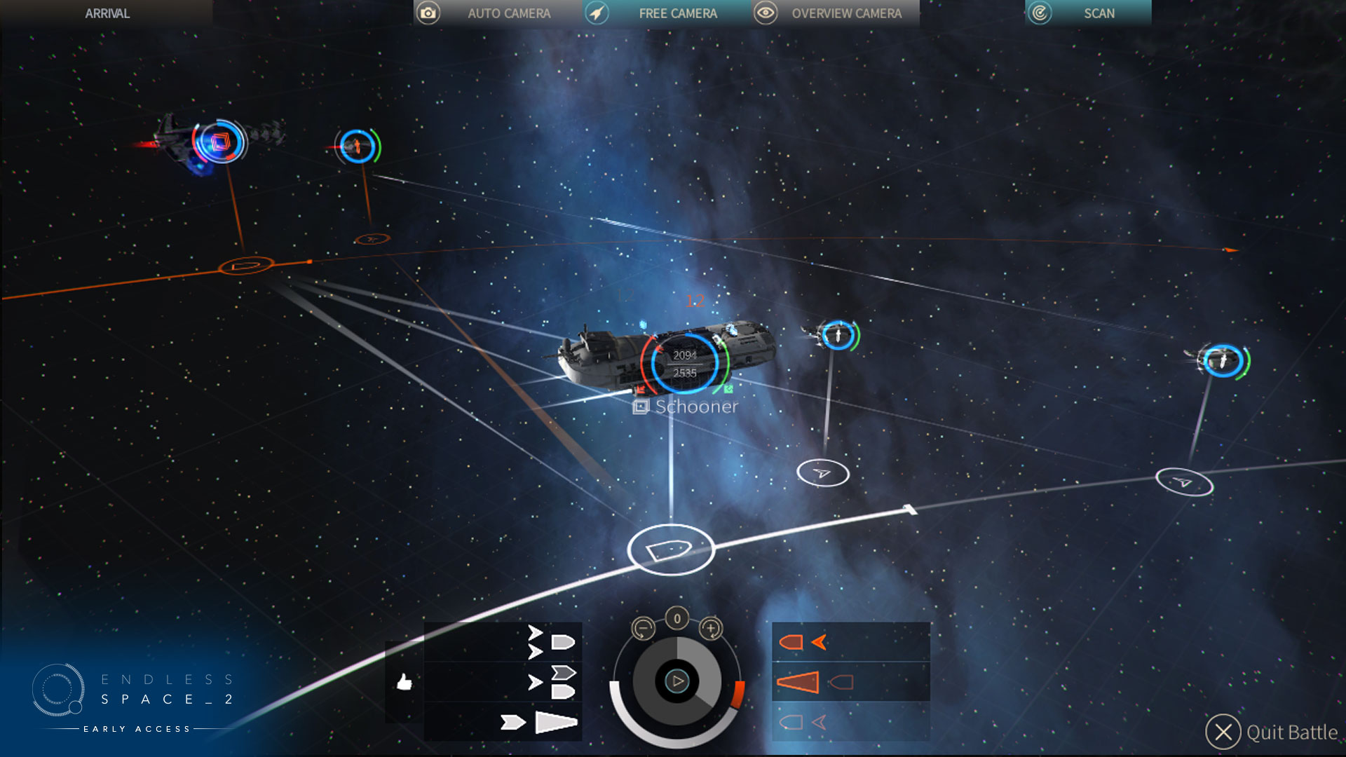


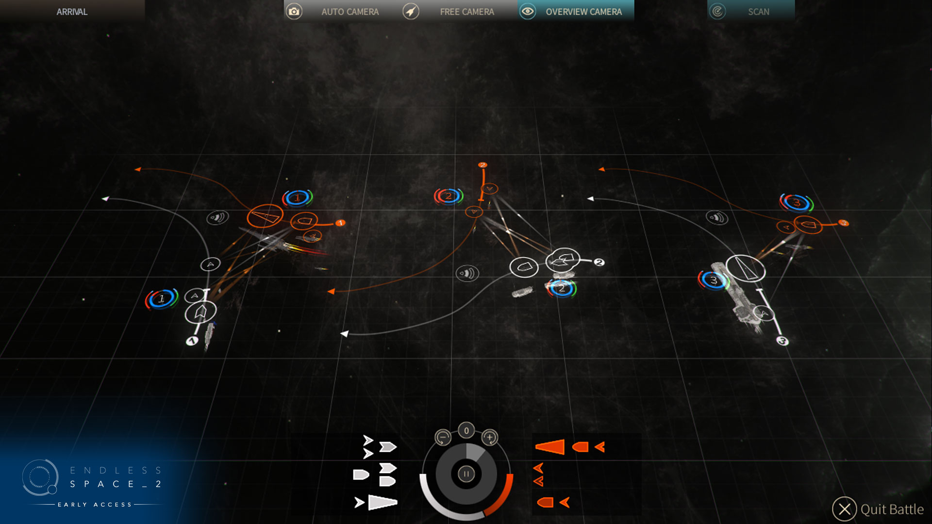
We've also added a new camera mode that will give you a bird's eye view above the battle theater (birds in space?). We adapted feedback to this view by making important information more visible, and masking the rest to avoid noise. A particularly important piece of data is easily visible from up high: actual range between flotilla pairs.


In free cam, we are now displaying when a ship is locked (allowing you to follow the ship and move the camera around) and added the possibility of zooming with mouse wheel, even if no ship is locked.


BATTLE REPORT


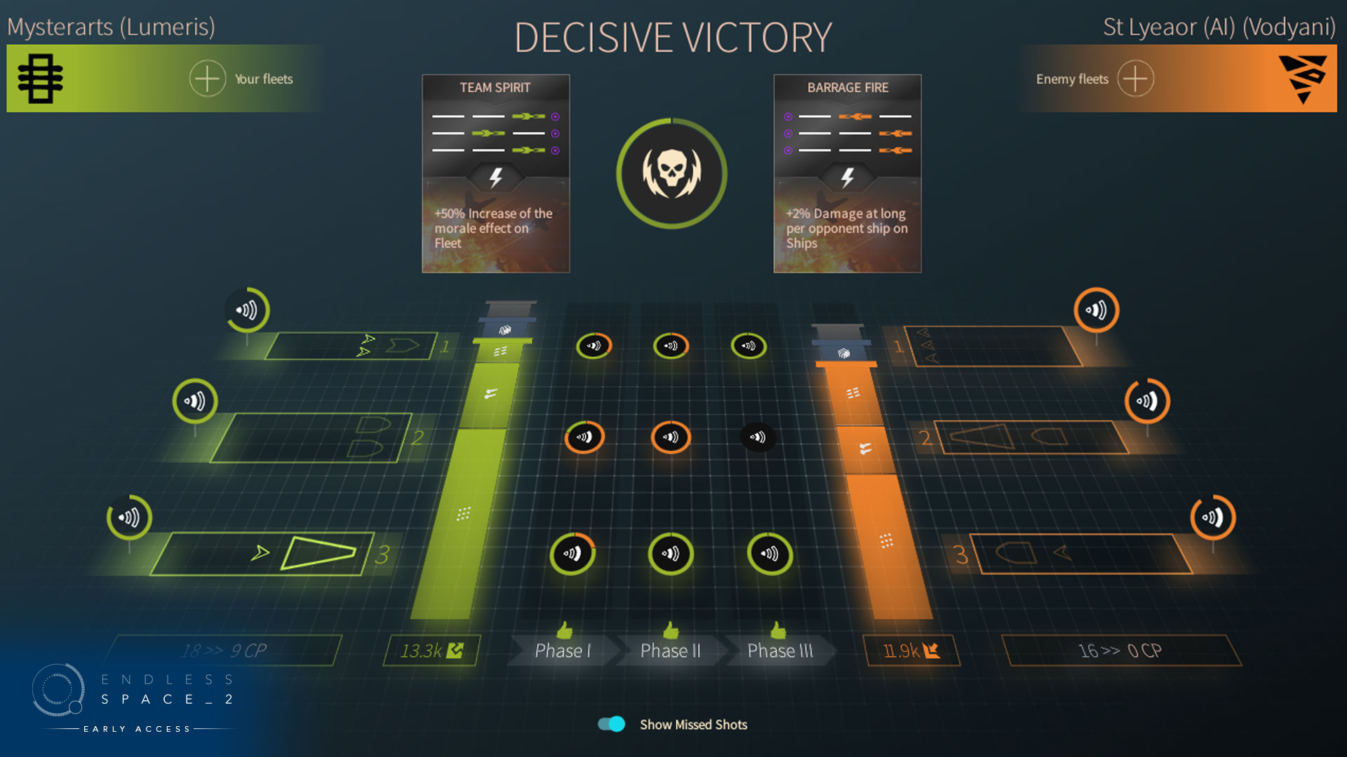
In order to improve understanding of what goes on during a battle, to understand the result and how to improve one's strategy against an opponent, we have added an advanced post-battle report. It is accessible through the battle result notification. Don't be afraid now: it does come with quite a lot of detail...


On that screen, you'll be able to see each side's flotillas, their range intention and the ships, destroyed or not. For each flotilla pair, you will get the battle's effective ranges, divided in 3 phases. For each phase, you will get the damage ratio for each flotilla.


Each side has a gauge showing the damage done to the opponent. The total gauge indicates theoretical damage you should have inflicted. Inside are displayed missed shots (because evasion or range incompatibility), and damage absorbed by the opponent. The remaining gauge, the same color as the player, shows effective damage. They are divided to show weapon type. Mousing over these various gauge parts, you obtain details and strategic info (for instance to counter a particular damage type).


BATTLE SYSTEM


Critical hits are back! The principle is simple: a critical hit bypasses enemy defense without being absorbed. It is therefore very interesting to use weapons prone to critical hits, such as energy weapons and using strategic resources, against an enemy prone to stopping your damage.


Ship crew has been overhauled: you now get a damage bonus when you fill your ship's crew to capacity. Specific weapons are particularly effective at killing off crew members, whereas certain crew modules reduce damage taken by the crew.


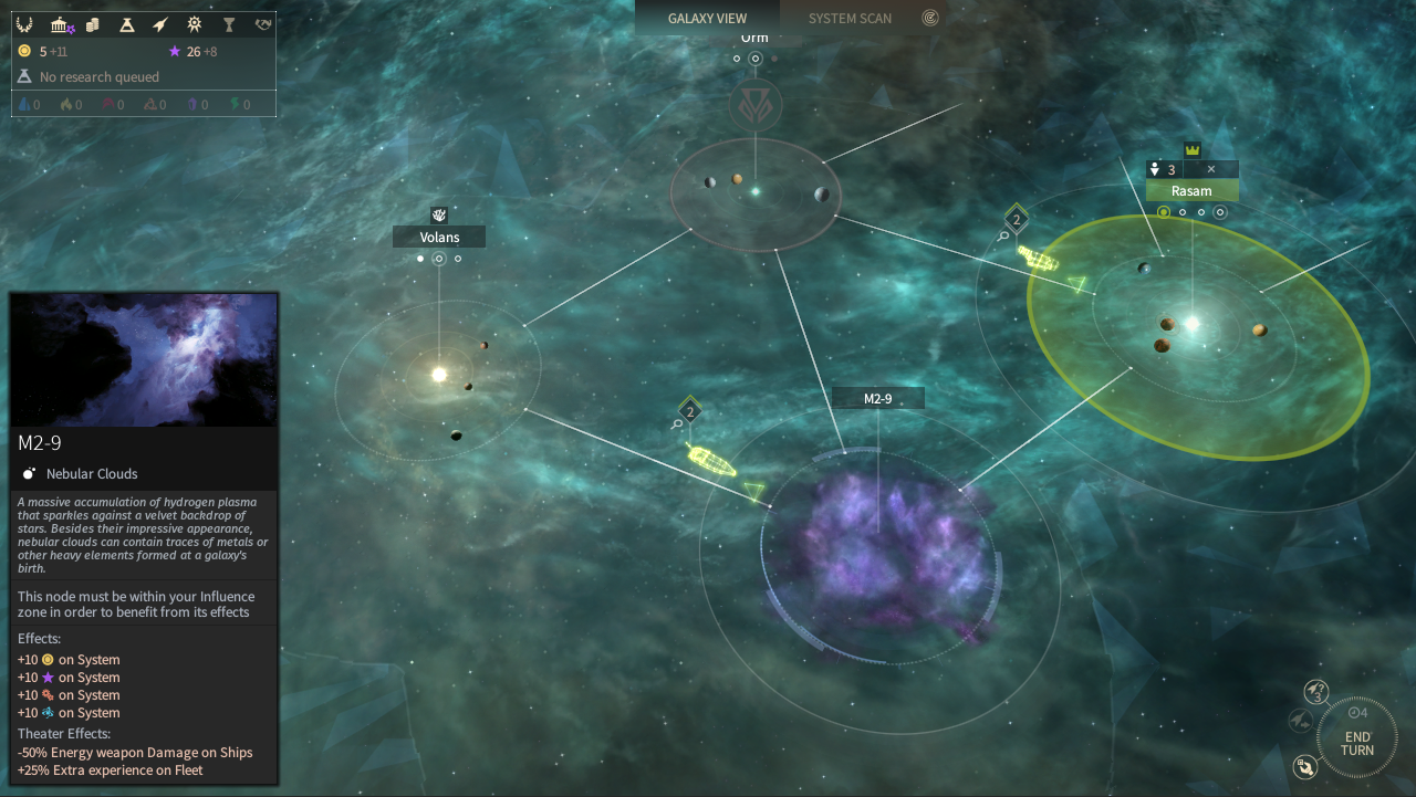
We have also added battle theater effects: make sure to check in the tooltip or the battle notification which effect is active on this node. This can really turn the tide of battle! For the moment, we have added these effects on special nodes, easy to spot in the galaxy.


CONTENT


Balancing has been done on weapons and defenses. Global progression has been lowered to avoid creating too big of a gap. Costs have been reduced to encourage shipbuilding. We have specified and improved the flak effect of Kinetic modules. We have made strategic weapons more interesting by increasing their power but also by adding specific effects, such as the possibility of affecting ship crew (for beams and missiles), and for release we're preparing different effects per strategic resource type!


The big news when it comes to Battle content is in the 15 new modules, with several versions, some of which have special effects granted by strategic resources. We'll let you discover them and how to get them (hint: curiosities and around the tech tree!). Among the effects, you'll find targeting, resource gain, repair or ship/flotilla synergy... Many of these modules are especially made for support ships and/or have an effect on an entire flotilla, so as to make them more interesting, but also to make flotilla distribution more important!


This covers the biggest changes around the Space Battle. The Riftborn Update drops tomorrow at about 6PM CET.


We hope you're excited!


Copied to clipboard!
0Send private message
8 years ago
Mar 23, 2017, 3:56:12 PM

Another stellar update by the looks of it.


Working close together with the fans and listening to constructive feedback in a manner unprecedented in any other game  to my knowledge.


I will start buying games as a gift to friends in steam to show my support if you continue this way  :)

Updated 8 years ago.
0Send private message
8 years ago
Mar 23, 2017, 10:46:02 AM

I like the new modules style, but they look a bit confusing at first glance. At least to me.

Hopefully that will change when I get my hands on the patch.

0Send private message
8 years ago
Mar 23, 2017, 2:51:10 AM
Divinicus wrote:

Damn, you still didn't fix that despite the ship design UI overhaul!


This UI inconsistency is very disorienting.

EVEN MORE in the new ship design where you manage to show both different way next to each other. what wrong with you? :)

It's obviously intentional. Currency before the number is when It is displaying the amount you have on hand, currency after the number is when it is displaying costs.

0Send private message
8 years ago
Mar 23, 2017, 12:01:49 AM

Not trying to poo poo on the info given, it looks great by the way, but starfighters/bombers aren't going to be in yet still? 

0Send private message
8 years ago
Mar 22, 2017, 11:36:17 PM

Good improvements here and no doubt you heard and tried to solve most of community concerns.

Just worried about few things:


- In new ship desing screen you can see how much of each resource you own, but not how much you're producing. Or at lest this seemed in your stream, and seen nothing that contradicts it in this post. Knowing how much you produce is a very interesting info.


- Good job in new scan battle view and after battle report. Still not sure if this is easy to understand. I'm asking myself some questions about screenshots and stream, and have lots of questions about their interpretation. Can you make a post explaining what we are seeing? If this comes with examples better. As side note here, I have to recognize Frogsaquadron job here, but still IMO this two screens gives you good info and deserves their own post with an accurate explanation.


Said that, I have to recognize you great job with this new update. After update 2 this game is playable only with balancing, but you didn't stop here. Instead you made more improvements and answered community concerns. Congrats!

0Send private message
8 years ago
Mar 22, 2017, 10:41:43 PM
Divinicus wrote:

Damn, you still didn't fix that despite the ship design UI overhaul!


This UI inconsistency is very disorienting.


What's disorienting here? Top shows how many you have and bottom in the construction page shows how much it costs. Please elaborate more.

0Send private message
8 years ago
Mar 22, 2017, 10:39:31 PM

Damn, you still didn't fix that despite the ship design UI overhaul!


This UI inconsistency is very disorienting.

EVEN MORE in the new ship design where you manage to show both different way next to each other. what wrong with you? :)


Updated 8 years ago.
0Send private message
8 years ago
Mar 22, 2017, 10:27:56 PM
Hinin wrote:

I can't wait to see the different combinations possible with all the unique effects of the modules. 

Imagine : 

- A defense fleet specifically made for destroying the crews of attacking ships and so prevent successful ground assaults ;

- A "commando" fleet with good mobility, detection and armor, made for disrupting your opponents' economy before big offensives ;

- A "kamikaze" fleet full of fragile but "cheap" ships (although minimal defenses in order to survive long enough to deal damages would be indispensable) made for dealing as much critical hits as possible to expansive vessels ;

And so on... It'll be nice to see what people will invent with all these modules, tactics and arenas.

Intersting Tactics :P. 

RwWolf wrote:

Got a question about multiplayer, when I start a fight against an AI opponent and I click "watch battle" does anyone (human player) else get to see the battle ?

I was wondering this also.  I assume it would be the same as in ES1 but I havent played it.  do you know if battles were watchable in multiplayer in that?


One thing I was wondering tactics wise is is it possible to get around enemies so say they are in a perfect choke point on the map (so no other lanes around it at all thus protecting anything past them) will there be ways to get to other planets without the use of space lanes? I noticed that there are some techs that allows you to jump to disconnected ones but how far will you be able to jump.  So essentially will you be able to flank enemy fleets? or will there be ways of scouting them other than maybe sending probes to systems to see how far away they are in order to do hit and runs etc?  The reason I ask is if someone has one of these choke points they could do guard mode and you wont be able to simply run past them.  


Does anyone know if any of this is/will be possible?

0Send private message
8 years ago
Mar 22, 2017, 10:25:51 PM

I get so detached from game direction some times that I forget Amplitude actually listens to their community.  You guys are the absolute best.  Can't wait to play this and throw feedback/glitch rage on the forums!

Updated 8 years ago.
0Send private message
8 years ago
Mar 22, 2017, 8:10:58 PM
Piddyx wrote:

The changes look great!  I like how you redid the icons for the modules and added just a splash of color.  Very classy.  

Any idea on when these changes will be rolled out?

tomorrow. it said it in the article.

0Send private message
8 years ago
Mar 22, 2017, 7:53:34 PM

wow i cant wait till tomorrow !!! great job ES Team 

0Send private message
8 years ago
Mar 22, 2017, 7:16:24 PM

Have you rebalanced the resource based weapon and defense modules to make them worth using?  Or are they all still weaker than the standard white modules on unlock?


Image Showing Module Stats and Comparing Resource Based Modules to Standard White Modules: https://medias.games2gether.com/forums/valhallasashes/Module%20Stats%201080.jpg


Discussion source where this particular image was discussed:  https://www.games2gether.com/endless-space-2/ideas/63-ship-designer-module-editor-for-customizing-ship-modules?page=2

Updated 8 years ago.
0Send private message
8 years ago
Mar 22, 2017, 7:10:47 PM

I'm eager to see the new weapons & shield stats :)

With crit back, I hope save / reload battle were studied (like saving the random seed and restoring it so a player can't reload/replay a battle if he lost crucial ships "on the edge").

Let's wait to understand those support modules to critisize weapon & shield's stats (at first glance, ranges of 94%/100%/86% (omnirange, or so) seems to be a little op for two guns).

What I can tell by those ranges is it seems the kinetic & laser recentered to medium and their extremes range specialties got nerfed. If this is it, I like that. I think I understand the choices (I would have prefered a third set of weapon though : new toys, best toys :) :) :) )


I'm not sure if the dps stats are right too, because in long range, it seems 94% of what outputs 100% in medium (382) does 382*0.94 = 359, not 188. With 188, one gun is not shooting there but you still display 94% and not 188 * 100 / 382 = 49%.

This could have also gain to be broke in two lines, one for projectile and one for energy because this helps to understand if your ship is designed for attacking big plate ships or big screen ships.


And with 188, 188 x 40 sec means you can explode two of those ships, or more, in long range before phase 2. It seems to be OP (to me, a ship fitted with 2x weapons / 3x defense shouldn't be a glass canon : it should be able to soak its own damage).

Or maybe it shows dps x 40s allready but in this case the attack / defense AI indicators are wrong in their values (A 1916 / D 382 = glass canon. Are they inverted ?).


And lastly, as a strange coincidence, the shield AI stat is 382, exactly what is displayed in medium damage. And the line under the short range displays 359 aka exactly what I calculated for long range dps at 94% there. This seems to be... bugged ?


But let's wait for the patch and in xml to see the details. I must wait to torture flies... This is hard :)

I like a lot the design of the new icons, very good design on that. Guns are easy to spot. But support & shield differences are not instinctive. For pure defensive modules, I would have removed the edges of this cube, keeping the hexagon shape, and draws plates / shield inside the shape (but keep the same cube logic, since the cube seems to be "the ship"):

- guns would be the cube firing

- support would be cube projecting an holo-sign

- defense would be inner-cube

=> therefor, you can understand the fit at first glance without decyphering the support / defense different icons.


Alternativly, you could have made support modules projecting icons on top face (but... ugly ??). Or maybe keep those shield / plate icons, remove the edge for all support icons and move the holo-stuff inside (this may be better) ?


In the fitting screen, in the details box, just on top of "Projectiles", those projectile icons => this could have been better, I think, if the projectiles icons were more like \ (antislash) than those / (slash), to fit the gun module icons shape (energy shooting right and projectiles shooting left).
I also think shield absorption in details should be Y-mirrored too, and both shield & plate modules could be Y-mirrored (with the logic of "the ship receives energy or projectile like the gun modules are drawn").

Updated 8 years ago.
0Send private message
8 years ago
Mar 22, 2017, 7:09:39 PM

The changes look great!  I like how you redid the icons for the modules and added just a splash of color.  Very classy.  

Any idea on when these changes will be rolled out?

0Send private message
8 years ago
Mar 22, 2017, 6:43:11 PM

Got a question about multiplayer, when I start a fight against an AI opponent and I click "watch battle" does anyone (human player) else get to see the battle ?

0Send private message
0Send private message0Send private message
8 years ago
Mar 22, 2017, 5:25:54 PM

I can't wait to see the different combinations possible with all the unique effects of the modules. 

Imagine : 

- A defense fleet specifically made for destroying the crews of attacking ships and so prevent successful ground assaults ;

- A "commando" fleet with good mobility, detection and armor, made for disrupting your opponents' economy before big offensives ;

- A "kamikaze" fleet full of fragile but "cheap" ships (although minimal defenses in order to survive long enough to deal damages would be indispensable) made for dealing as much critical hits as possible to expansive vessels ;

And so on... It'll be nice to see what people will invent with all these modules, tactics and arenas.

Updated 8 years ago.
0Send private message
?

Click here to login

Reply
Comment