Logo Platform
logo amplifiers simplified
Frogsquadron

Frogsquadron

6 years ago Oct 03,2018, 16:02:17 PM

Umbral Choir Making-Of, Pt 3: Art

Reply
5 975 Views
34 Comments

Hey everyone,


This blog post is the third of a series focusing on the creation process of our upcoming Umbral Choir. We covered the game design aspect, now the art, and if everybody's on their best behavior, finish with a G2G vote or two! Ever wondered how the secret sauce was made? Here's your chance!


Today, we spent a long time hovering riiiight behind one of our concept artists & illustrators, Thibault, to watch him in action.
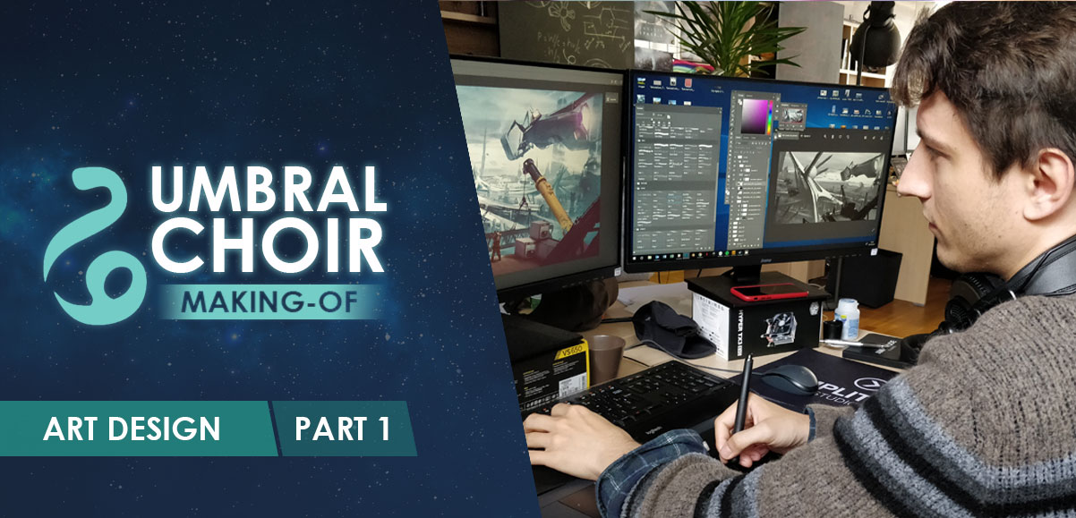


We made a little video of the results (shown below!) at the end of the day, and we sat down with him to ask a few questions:


Can you please introduce yourself and tell us what your role is within the team?


My name is Thibault, I've been at Amplitude for a few months now. I'm a concept artist and illustrator. I've been in the gaming industry for about five years, and before that I used to illustrate mostly sci-fi books. At Amplitude my role is that of illustrator, with a side of concept, so the tools I use are mainly Photoshop, with some sketching before, sometimes a bit of ZBrush. I try to create a visual support for the world the narrative designers tell me about, to try and match the factions, the quests... whatever needs to be shown!


What were the inspirations and challenges behind the creation of the Umbral Choir?


As far as inspirations go... smoke! Just kidding, although to be fair what had already be done by Ronan (other concept artist & illustrator--ED). It was a waft of smoke, mostly shapeless, with small eyes, and what appeared to be a smattering of dots like a constellation inside. Very spooky. So that's what I started with, and then came the challenge: how do you come up with a waft of smoke that you can tell apart from other wafts of smoke, that you can recognize? You can't just make a cloud of smoke, you have to give it a bit of a shape. If you stick to what's inside the smoke, it wouldn't be enough. In any character design, what comes first is the silhouette, so good luck recognizing the shape of a puff of smoke. So I made the decision to give it a shape, something a bit snake-like to stay away from humanoid shapes, but just to make it so that we could recognize it. Some differences in smoke color and the eyes would eventually be the only differences, along with the constellation inside. That... that was the biggest challenge, making them distinctive, and making them all interesting in their own right. I took inspiration from Starcraft's Protoss, for the echoey voice and the color scheme, and also from Warhammer 40000's Eldars and Necrons, for the unfathomable aspect of their technology and origin. You get that there's power there, but you can't explain it, or where it comes from.


Please walk us through the creation process for the visuals of the Umbral Choir Heroes?


At first it was Photoshop, making a few drafts for the silhouette so I could show it to the rest of the team for their input. A star to start and a single line. I went with a snake-like shape, because it seemed the most appropriate. I worked on the composition of the picture, but again, I asked for a lot of input, because it's very tricky to personify smoke, not only that but to also make it a distinct person, rather than a cool-looking VFX. Then I started adding color, blue, black, stuff with a very high contrast. I created some meshes as a base on ZBrush for the backdrop, since it's pretty much the only solid element in the picture. For the smoke itself, I started with reference pictures, as it's a good way of getting some very realistic-looking drafts, and then hand-painted my own smoke, and started creating the character from there. I made it a little lighter in parts to give an impression of depth, reworking the shape of the smoke to suit the character and the composition of the picture better. Brushes are cool to work with since they're made of particles and so are a little different-looking than the real thing.


In the end, I worked on the little distinctive details, the eyes, the stars, the red antennaes... and then you pretty much had it. We don't know its name yet, and the writers are still working out how their society works, but we know this is somebody and they're their own person.


Oh, and the blue potato thing comes from me trying my hand at making a shape I could drop texture on, to make it pop a little more, at least the "head". I mostly ended up painting over it with the smoke, so when I'll do the others, I'll probably do away with that bit of the process and stick to the 2D part, it's sufficient.


***


Watch the process here:


Here's the full result!
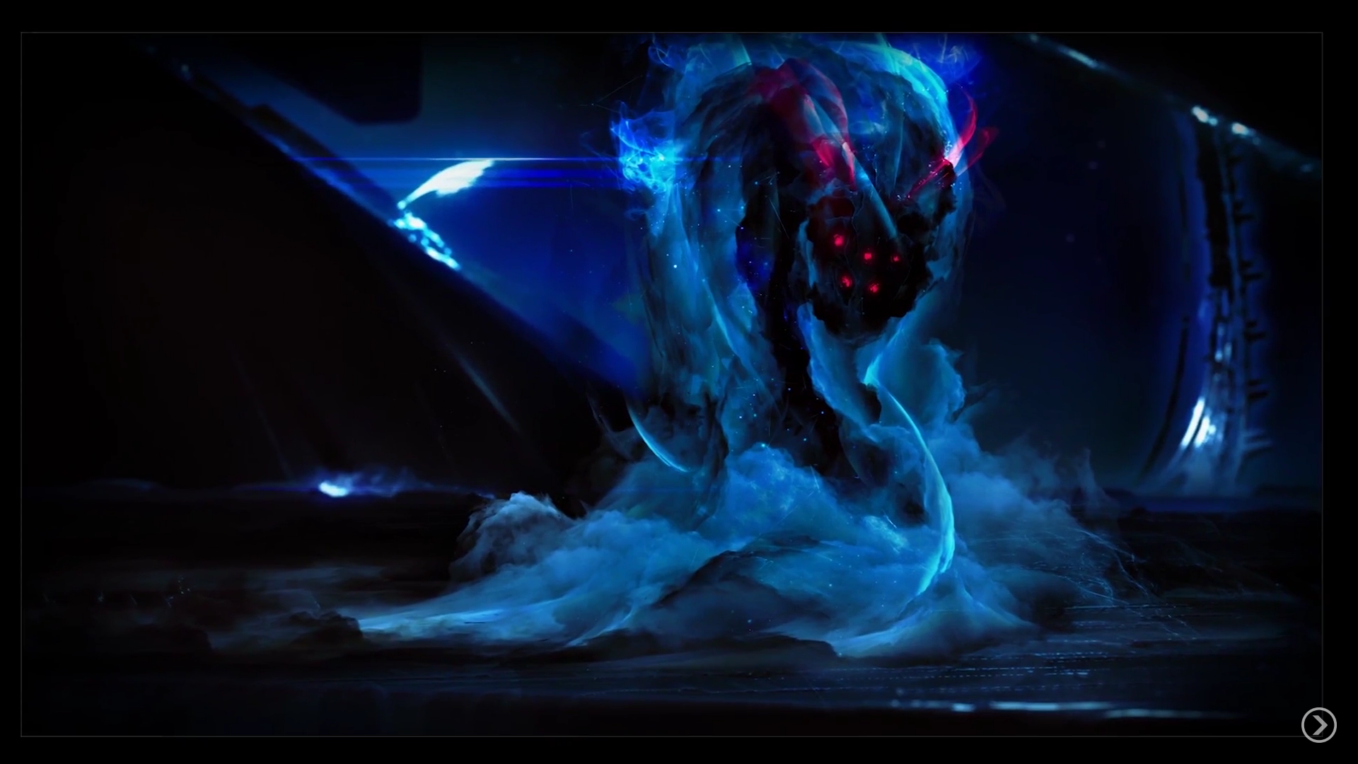


We hope you enjoyed this look behind the scenes at our art creation! More on art next time, with a blog in which we'll show you how we created the ships of the Umbral Choir... and for now, is this how you imagined them?


Copied to clipboard!
0Send private message0Send private message
6 years ago
Oct 4, 2018, 11:21:04 PM

Omg...


I see what you did there! 


Step 1:

Protoss reference, Smoke, a Shadow among shadows, Return after thousands of years


Step 2:

Metallic ring in the back ground with a blue-ish glow.


Step 3:

Praise, thee glorious Goa'uld mindtaking snake! We shall erect pyramids to serve thee and thine vessels!!! 

(I feel like that picture shows, that they are REALLY small, like... well... Goa'uld ^^)


But in all seriousness: 

I like the style and if they play the way I hope and think they will play out, definately my faction :-)

0Send private message
6 years ago
Oct 5, 2018, 9:00:53 PM

This is an amazing artwork! It looks really cool. From the looks alone I want to play this faction.

And it seems really alien.


Have you considered sending some art pitches over to the Star Trek Discovery team? They should hire you. This artwork matches the shows colour scheme really nicely and would make for a cool looking alien encounter. Just saying.

0Send private message
6 years ago
Oct 7, 2018, 7:34:45 PM

This reminds me of movie The Keep when the monster forms out of smoke. They used some weird technique to make it look like smoke moves backwards. Looked dope.

0Send private message
6 years ago
Oct 9, 2018, 1:24:43 PM
MezzoMax wrote:


Have you considered sending some art pitches over to the Star Trek Discovery team? They should hire you. This artwork matches the shows colour scheme really nicely and would make for a cool looking alien encounter. Just saying.

Leave the guy alone he's just arrived!

0Send private message
6 years ago
Oct 9, 2018, 4:45:25 PM
Leothehero2110 wrote:

Is that a Ringworld I see in the background?

I'd actually like for them to live around Dyson Sphere to finally give different star types some meaning.

0Send private message
6 years ago
Oct 9, 2018, 9:13:40 PM

I like it, but based on the concept art I always imagined their true bodies to be those constelations inside of them, while the smoke as something the likes of fur, a thing that gathers around their constelation bodies. That way they could be more then just snakes. In the presented image the constelation part is barely visible, which I think makes them much less unique. I'd love it if that part of them was presented more strongly.

0Send private message
6 years ago
Oct 10, 2018, 10:36:44 AM
Leothehero2110 wrote:

Is that a Ringworld I see in the background?

I mean... maybe?

0Send private message
6 years ago
Oct 11, 2018, 4:57:31 PM

Wow! reminds a little on the Ring wraithes spying and killing for Sauron. BTW: have the rings (or devices) for beeing invisible? ;-)

0Send private message
6 years ago
Oct 12, 2018, 12:22:19 AM

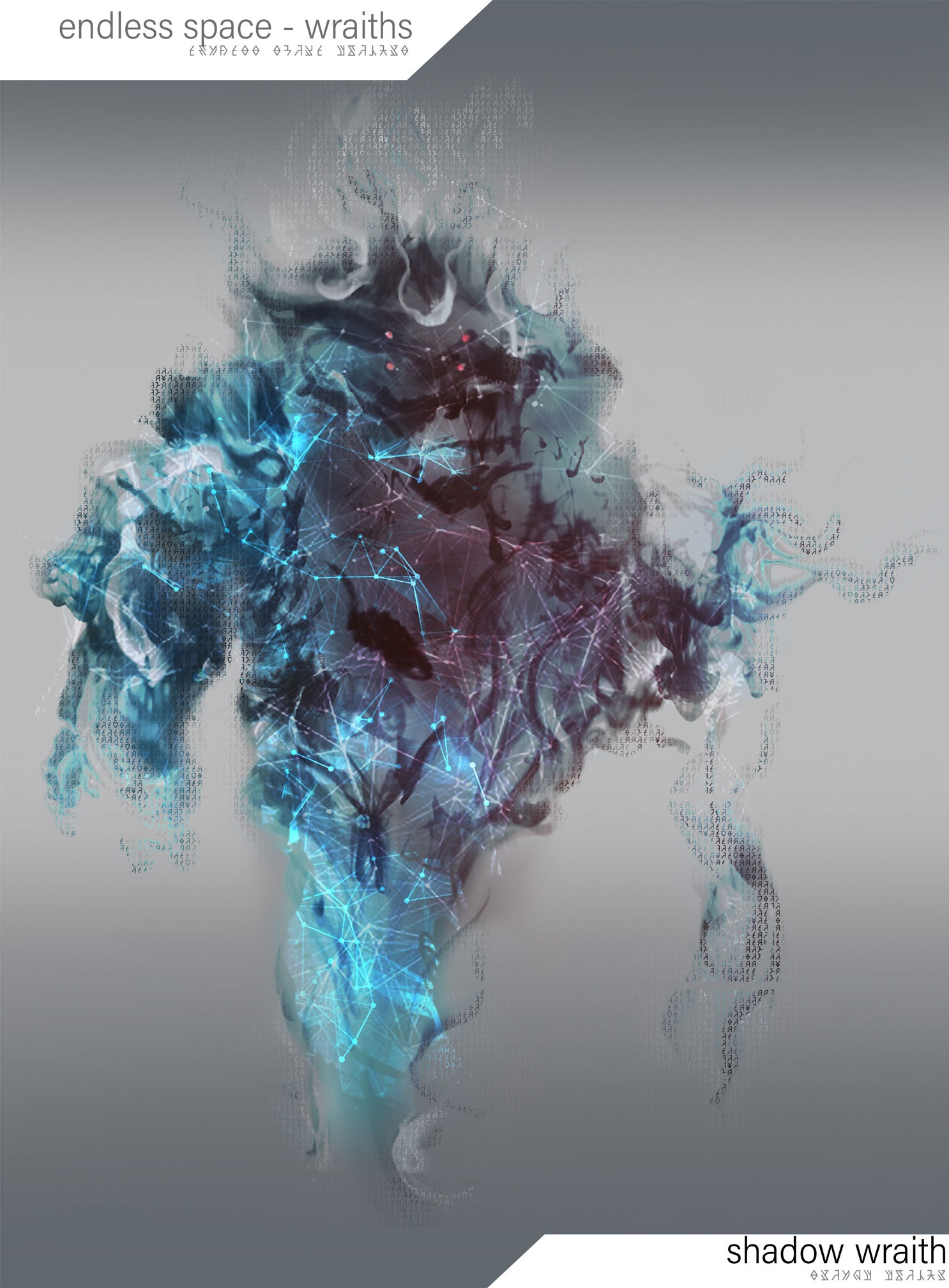
How about making it even more alien, no symmetry, still vaguely snake-like but more cryptic, something like this:


Updated 6 years ago.
0Send private message
6 years ago
Nov 18, 2018, 5:51:00 PM
EndlessCrashes wrote:

How about making it even more alien, no symmetry, still vaguely snake-like but more cryptic, something like this:


My dude(tte), that is dope! I love it when the community of any game gets to build the nextfaction/feature/story/etc.

0Send private message
6 years ago
Oct 3, 2018, 8:51:54 PM

Awesome!

Amplitude art never dissapoints!

0Send private message
0Send private message0Send private message
6 years ago
Oct 3, 2018, 5:00:26 PM

Will try to create a little "Intro" for them, as a fan try. But there.... let's try a quick one, without further "study" (sorry if bad english)


" We've lived through eons, and ages ago, some new species come, proclaiming them as god.... But we've stayed in the shadow, overseeing everything, looking at all of their actions.

With the times, the false god disappeared, and many species lives on the galaxy, ignorant of our existence, letting us learn through them. Infiltrate them. But as the fire growl in the galaxy, with some claiming peace, gold or war, it is time.

Time for us to unveil the truth and to awake. We, as the Choir, will crawl out of their shadows and stab them where they saw only dark. We will go out of our black hole and taking them to the void."


0Send private message
6 years ago
Oct 3, 2018, 6:20:13 PM

The serpent-like idea is very good !


Vardonis : Well, that's a good summary of the faction, I think. But I wonder what is there motivations... power ? Or knowledge ?

0Send private message
6 years ago
Oct 3, 2018, 6:22:07 PM

Looks great, and I love that you show us how it works behind the scenes.

0Send private message
6 years ago
Oct 3, 2018, 6:37:55 PM

@Najakir Why not both?

Maybe i'm wrong, but i see them as Religious, and the 2 aspect can be here in religion. In fact, the 2 can be split in 2 group... If we admit The Umbral Choir is more than one entity. if you know what i mean.

0Send private message
6 years ago
Oct 3, 2018, 8:41:08 PM

It feels like the shape is lost beneath this thick layer of smoke. Somewhere at 1:04 it looked a bit more appealing. But am feeling it still!

0Send private message
0Send private message0Send private message
6 years ago
Oct 4, 2018, 1:32:33 AM

That little video was amazing. How long did all that work take?

Whatever you're paying Thibault, double it!

0Send private message
0Send private message0Send private message
6 years ago
Oct 4, 2018, 11:32:58 AM

It really looks good!
not quite like I imagined, but I like it a lot

(the constellations inside the smoke is such a nice detail! good job)


>You get that there's power there, but you can't explain it, or where it comes from. 

This is very true, and a very good mindset to go for illustrating this faction

0Send private message
6 years ago
Oct 4, 2018, 11:36:54 AM

So you made a snake-ghost with glowing red eyes. Totally not scary. At all. They hide because they don't want to scare people to death. How kind of them...

0Send private message
6 years ago
Oct 4, 2018, 1:50:32 PM

It looks good. The video shows that Thibault is a very talented artist. As personal preferences go, I like the original design that was voted for the best.


That's just my preference though. If they go with what was shown in the video, I will still be pleased.

0Send private message
?

Click here to login

Reply
Comment