Just finished taking the feedback survey oriented G2G/Amplifiers. It touched on a few things, but seemed mostly oriented around the usability, viability, and presentation of the site itself. In an attempt to provide more useful feedback, I'm posting a couple of thoughts here, using examples.
Hopefully these changes would make the site more usable and new-user-friendly.
Firstly, even when logged into the site, the main page (or landing area) tries to ask you to register for the website and log in.
Beneath this large banner, four sections on the page try to communicate what is possible on the website; these do not link to anything, and obfuscate the 'Recent News' section, and Forums below.
While the site has had issues with spam in the past, this obfuscation just makes it even harder for legitimate users to engage with others on the site. This is exacerbated by the sections where users can submit ideas being squirreled away under subheadings in darkened buttons on the left-hand side; what is in my opinion the most interesting, and exciting, part of the site is hidden away as if they're something to be ashamed of.
We see this same issue in each of the tabs, too. I think it would be fair to say that no-one using Amplifiers/G2G currently would need a giant box that links to buy a game they likely already have. In any case, it just serves to annoy current users or irritate people interested in learning more that maybe don't want to be advertised a game they're already looking into.
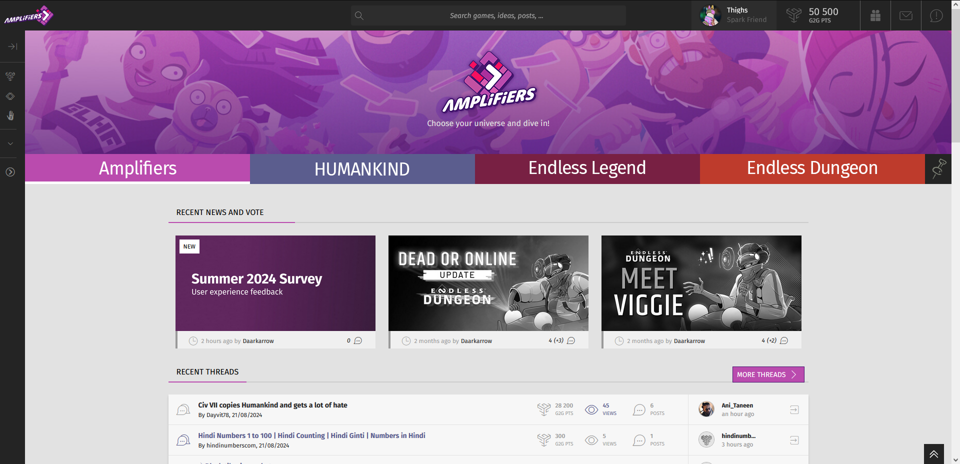
In any case, this is a very basic representation of a more user-friendly/clearer redesign; while there are multiple buttons that do the same thing, this attempts to cater to the new user experience and the older users:
 I've not spent much time on it, but it removes the aspects of the site that were mostly bloat, at least a 'Don't show this again.' prompt or option might help the site be clearer in that regard, really.
In any case, there's a very basic 'Pin' icon on the right, implying that each banner could be customised, but it's just a thought. There could be more banners, one for each game, it really depends on user preferences; for example, I've no interest in the Endless Space forums but would want to see HUMANKIND and the games outside of the original titles.
The forums are given prominence too, as opposed to being tucked under infrequently updating news posts and votes. The banner art has always done good work to communicate what the post is about and the caption/description section just works against getting users to click through to a topic and read it, I feel.
Anyway, I hope at least some of this helps explain some of the basic issues with the site, from my perspective, and hope others can comment if they agree or disagree with the idea (though, admittedly, the entire 'Ideas' section and engaging with voting stuff up is an issue all its own).
Thanks.


Comments
INThighs
Spark Friend
And Alexander wept, for there were no more doors to open.
INThighs
Spark Friend
57 200g2g ptsReport comment
Why do you report Thighs?
Are you sure you want to block Thighs ?
BlockCancelAre you sure you want to unblock Thighs ?
UnblockCancelModerate comment
Annotate comment