I want to re-iterate a previous thread regarding this idea here as well. You all might have read it before but I want to propose it again in hope that it might end up in the game this time.
Posted on 19 May 2022
UI in Humankind is generally quite gorgeous despite the fact that it sometimes feels a bit sluggish at interacting with, which I've learned to omit while appreciating how stunning it looks. However, there are a few areas where the lack of necessary tools and inflexible implementation of some features creates a cumbersome and frustratingly tedious user experience. One of these problematic UI design choices pertains to All Cities and All Units panels and cycling feature through all cities/outposts and units.
I'll try to explain these issues that I'd really liked to see improved in order for us, the players, to have a more pleasant UI experience.
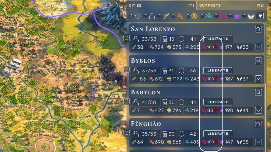
For reference this is one of those two panels I'm talking about:

- I always desperately need a button to collapse/open all items at once. It's not really fun to close 11 cities or 50 stacks of units one by one in order to see more items in a summarized level; furthermore, it doesn't stay as you organize and it keeps resetting itself to default view each time you load.
- Currently small white arrow button is assigned to changing the direction of sorting order between ascending and descending. This feature should instead be assigned to individual buttons for sorting criteria; i.e. press once on industry button for sorting by industry in descending order and press it again for ascending order. White arrow button can then be re-utilised as Collapse/Expand All button as described above.
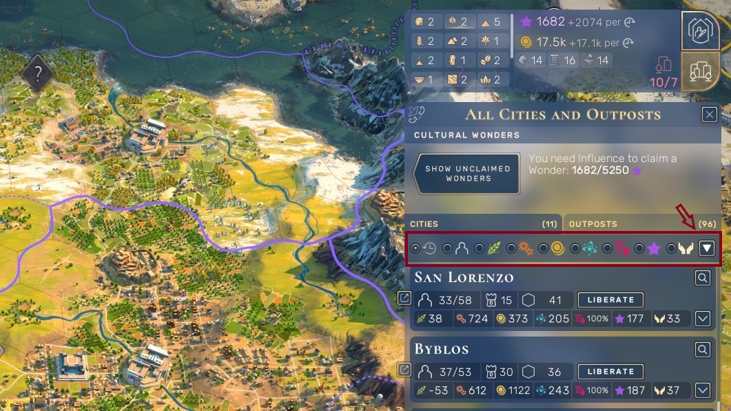
- I need to use keyboard shortcuts a lot for cycling through items quickly and conveniently but this feature is pretty much useless at the moment. The problems here are as follows;
- You can't cycle through cities and outposts separately. It's one combined list which wouldn't be an issue if you had only 2 cities and a few outposts to cycle through. It quickly turns into a nightmare, though, when you have 11 cities and 100 outposts.
- Sorting order used for cycling is currently fixed. I believe it follows chronological order of establishing outposts. Your capital is the first city you ever built (unless you change it later) and thus becomes the first item in cycling order until you conquer an AI city which was established before yours. Outposts that are built sometime in between all those cities are then scattered all around in this mess of a list. Cycling order should instead be adaptive and follow sorting order used/shown currently on the panel. This would make cycling feature immensely more useful for players. If I want to see top money generating cities on the panel I should also be able to skip forward and backwards through these cities by cycling shortcut.
- Same sort of problem also exists for cycling through units. Default cycling order should follow active units (ones with some movement points left to use) first and then exhausted units later. Sorting should be adaptive as well like cities as described above.
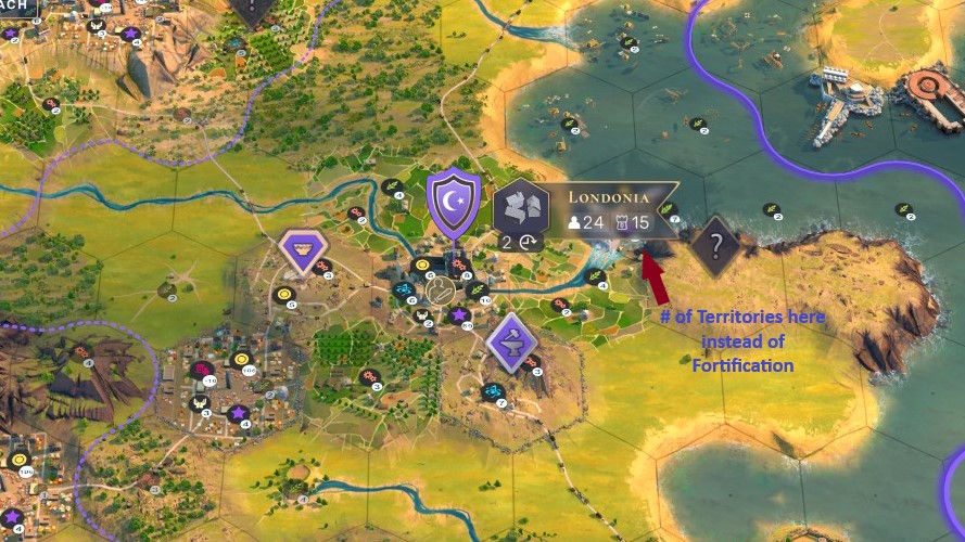
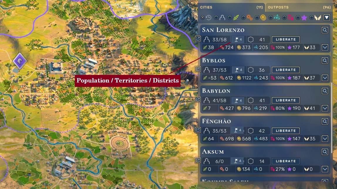
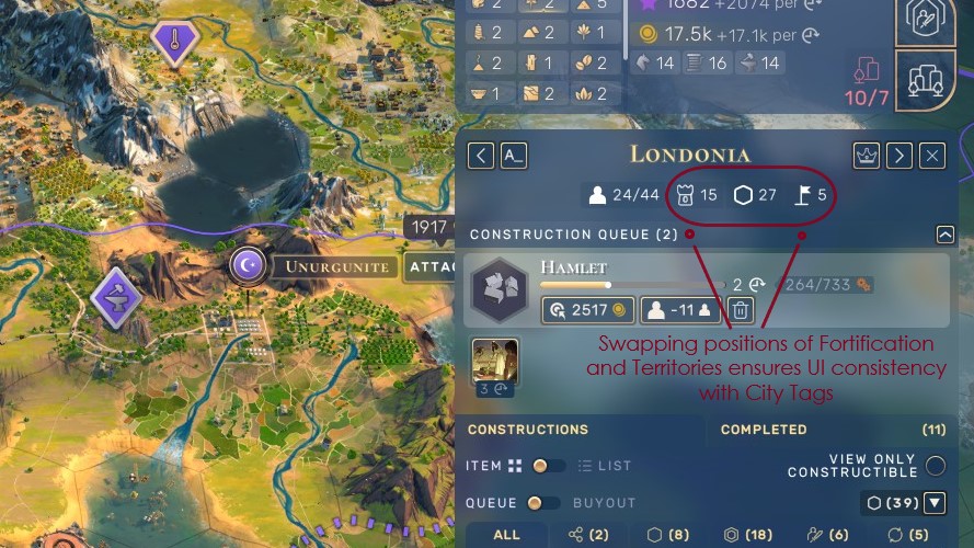
- City tags on the map and summary bars in All Cities panel should have number of territories instead of fortification value. I believe fortification is rarely a useful info that I'd like to check. Number of territories, however, is more vital to know when deciding which culture to pick next or calculating benefits of certain civics or tenets, etc. Fortification can be shown on the detail panel of cities at the top of the screen when cities are selected.
- Stability section in city summary bars now show current stability values which are not informative enough to evaluate how well or poorly your cities are doing. Target stability is more crucial to know if current stability is above a certain threshold (above 60%, for instance) and current stability is more relevant to show if it's below 40%, for instance. A simple '+' / '-' / '~' sign next to current stability value would more than adequately suffice to convey at a glance real status of my cities.
Link to original thread:
https://www.games2gether.com/amplitude-studios/humankind/forums/169-game-design-and-ideas/threads/48505-a-few-quality-of-life-improvement-requests-for-cities-and-units-panels?page=1#post-353295


Comments
Waykot
Tlahtoani
"For the Empire"
Waykot
Tlahtoani
27 000g2g ptsReport comment
Why do you report Waykot?
Are you sure you want to block Waykot ?
BlockCancelAre you sure you want to unblock Waykot ?
UnblockCancelModerate comment
Annotate comment