Currently I sometimes feel quite overwhelmed by the amount of information that the game offers us. We have at our disposition powerful tools that allow to examinate in depth some aspects for the game, but I think that sometimes this features end up being an obstacle to some players, especially the new ones. So, here is a list of ideas that, in my opinion, should help keeping clear the UI:
-Yields per-turn "readable at first sight"
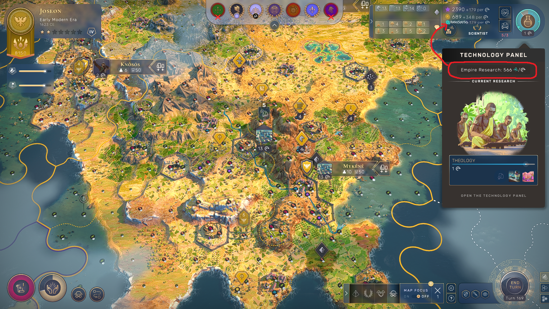
The game allows to see your Science per turn only when you move the cursor over the Science icon. Seeing your Science per turn under the values of Influence and Money would be useful. On the left of the value of Science per turn, I would suggest to add some kind of ratio (ex: Science per turn/ Science cost of the researching tech) to help the player figure out a compared value of their Science per turn.

-Game tools "readable at first sight"
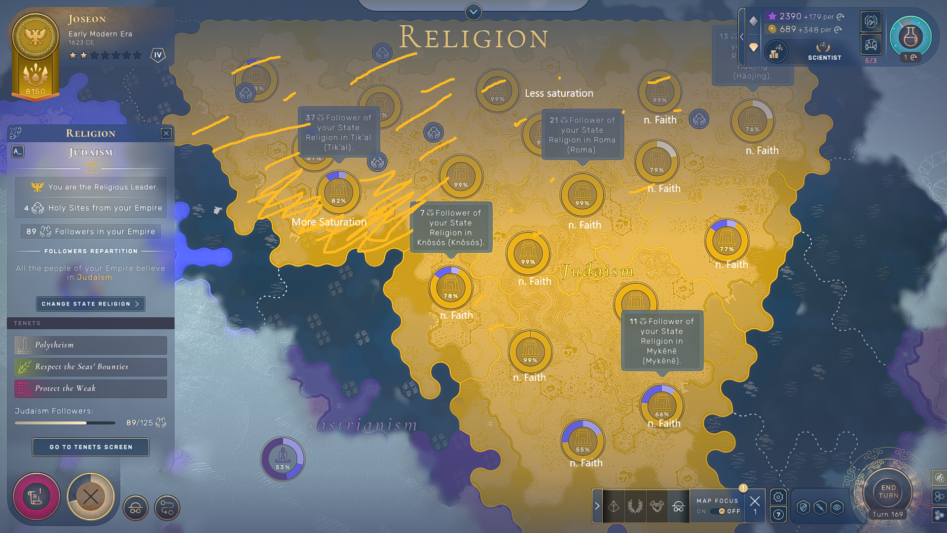
The Civic and Religious panels offer a huge amount of information, but its not always simple signifying every single data. I would suggest to give a territorial effect based on your empire's color shade that varies for the Faith/Influence production of that territory. The territory of your empire that produces the most amount of these yields should have 100% saturation while the other territories should have less. (ex: your most influential territory gives you 86 Influence while another one gives you 19. The first territory should have Saturation level of 100%, while the other one of 19*100/86=22%). Each territory should also tell you immediately its Influence/Faith production per turn when in its respective panel mode (I suggest under the percentage that tells you which empire influence that territory). I would also suggest to apply a similar feature also in the Espionage/Commerce panels.

-Infrastructures should explain their yields
ex: Animal Barns gives you total 23 Food. It tells you that it gives you 14 Food for Horses, 6 Food for Adjacency, +3 Food for Farmers Quarter. This is what the game should tell you when you have your mouse over the Infrastructure both when you're going/already have built it.
-Expand the Map Pins possibility
It would be nice to have more variation to choose your pins, especially for city planning. (at least one for each type of basic district, one for EQs and one for other special districts). The game should also offer you the possibilities to write notes for yourself in the pins (ex: you want to remind you in the save that you want to apply a certain strategy in a certain place).
-Infrastructure suggestions
It would be very useful if, for example, in a city in deficit of food the game would "suggest"/highlight Food infrastructures. When you have your mouse over a district type and the placeable district with the highest amount of [Yield] has less amount of yield than a type on infrastructure (and that infrastructure costs less), the game should suggest you to build instead the infrastructure. There should also be a way to filter infrastructures by their yield type and by who gives the biggest amount of that certain yield type.
-Strategic Logistic Panel
There should be added a new panel (or included in the commerce one) that highlights the roads, the railways and the "airways" (between your Airports, but also the ones of your allies that you can use) for understanding better both yours and your enemies logistic capabilities. It would be useful also having a similar tool for Military districts (ex: ability to immediately see where garrisons/silos are, seeing in which hexes units receive a CS bonus and of which value...)
-Pin objectives
The game should also allow you to pin on the main screen objectives (ex: World Deed, Stars, but maybe also Yield-type level of a certain city and stuff...) so not to always open different panels to see the only type of information that would interest you for the next 10 turns.
Note: I kindly remind you that, since 1M pts ideas shall potentially make its addition to the game, an upvote would be really appreciated.
Thank you for your support :)


Comments
Moderate comment
Annotate comment