Logo Platform
logo amplifiers simplified
Elegacy

Elegacy

6 years ago Apr 18,2019, 13:34:41 PM

#1 - Responsive Redesign

Reply
4 753 Views
36 Comments

Hey everybody, 


My name is Nicolas aka Elegacy. I’m the web designer for Games2Gether, meaning that I work to optimize your experience on G2G.  


It’s been a while since we’ve written a dev blog about the development of the platform. The web team and I are always working behind the scenes to improve the platform, and we want to start giving you more visibility on what we are doing and allow you the chance to give feedback!


In a few days you will have a new thread, where we will communicate the fixes & updates made on the platform. You can subscribe to this thread if you’re curious to see what’s fresh on Games2Gether. 


This article is focused on responsive web design (RWD) for G2G, which we’ve been working on since August 2018. The goal behind this project was to give you a better experience on your mobile device, and to create interactions specific to mobile use. For example, if you come across a G2G link on Twitter or Reddit, you can now expect a seamless transition towards a G2G page that is adapted to your device.  


In the visual below you can see the difference between the old version (pre-responsive) and the new one. You’ll notice that the readability of the whole page is improved. The navigation to the universe is now in a “hamburger” (horizontal) menu, and we’ve eliminated the zoom out effect.  
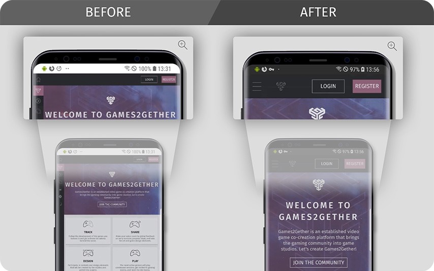


We also redesigned all the site’s content, threads, titles, & assets, as well as the universe navigation.  

In the old mobile version, which was essentially just a copy-paste of the desktop version, the different features were difficult to select, and the display was not accessible to your thumb. In the new version, you can use the arrows or your finger to scroll horizontally across the navigation bar.  
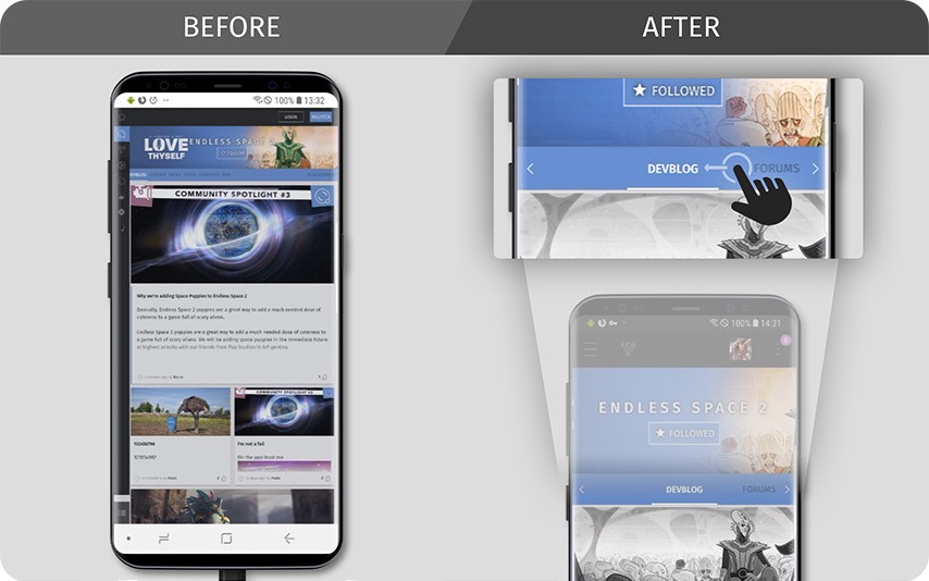


There is still some work to do on the responsive update, and we’ll continue to work on the evolution of these features. For example, the banner for Endless Space 2 in the above image is not optimized for a mobile display. Having to convert everything to RWD taught us that in the future we should design new features in the mobile format first, then adapt them to desktop, rather than the other way around.  
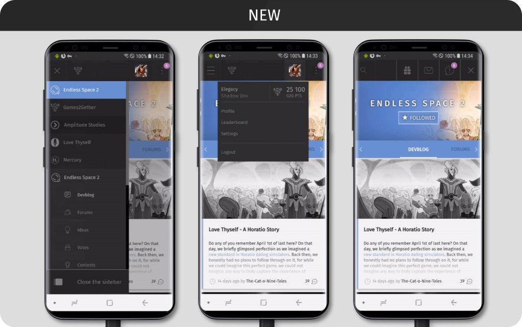


Your feedback interests us!  


Did you see the difference in your use of the platform on your mobile phone? Let us know what you think below! 

Finally, don’t forget to keep checking back. The development of Games2Gether is ongoing, and we plan to keep writing dev blogs for all the HUGE new features. We hope you’ll be a part of the conversation.  

 
Cheers, 


Elegacy & The Web Team 

Copied to clipboard!
0Send private message
6 years ago
Apr 18, 2019, 2:38:36 PM

Have noticed changes too. I have to say that you're making a good job!

Just curious, have you considered an App, or there's an easy way to put a link to G2G on my phone main screen?

0Send private message
6 years ago
Apr 18, 2019, 5:02:57 PM

This is awesome! Although I hold the same question as lo_fabre 


An app, possibly in the future, would be a terrific addition to the G2G platform. 

0Send private message
6 years ago
Apr 18, 2019, 7:11:19 PM

I actually check this site regularly on my mobile and it was not the friendliest site.  Thank you for the changes!

0Send private message
6 years ago
Apr 18, 2019, 8:25:48 PM

I actually read on some random g2g blogs a lot on mobile, and before this it was quite annoying and you can tell it wasn't optimized for mobile, but now I think it's much better. Thank you!

0Send private message
6 years ago
Apr 19, 2019, 7:24:49 AM

An app isn't totally out of the way, but there's a workaround in the meantime: you can add a shortcut (at least on android, I have not tested this on iPhone) to your homescreen. The website then behaves like an app.


We won't be able to make any progress on an app anytime soon as we are currently working on a number of improvement and new features that you will hopefully enjoy!

Updated 6 years ago.
0Send private message
6 years ago
Apr 19, 2019, 9:33:25 AM

I almost always access the g2g from the phone and I notice the changes from time to time. 

Updated 6 years ago.
0Send private message
6 years ago
Apr 20, 2019, 5:29:52 AM
Sobert wrote:

An app isn't totally out of the way, but there's a workaround in the meantime: you can add a shortcut (at least on android, I have not tested this on iPhone) to your homescreen. The website then behaves like an app.


We won't be able to make any progress on an app anytime soon as we are currently working on a number of improvement and new features that you will hopefully enjoy!

I haven't tested it the shortcut on iPhone because it's a saved website on Chrome for me, but yeah I was just talking about in the distant future there being the possible implementation of an app, especially as the G2G community grows larger. 


But yeah I'm looking forward (as always) to the new improvements and features! 

0Send private message
6 years ago
Apr 25, 2019, 10:43:14 PM

I never use my phone to browse the g2g site, but I welcome any change thanks

0Send private message
6 years ago
Apr 28, 2019, 5:20:58 AM

Yes, the difference between the old and new mobile experience is profound, and certainly a positive change, at least in my book. Keep up the good work!

0Send private message
6 years ago
May 7, 2019, 1:15:54 PM

Hi Elegacy and Sobert


I just tried it in Chrome on Android and it looks great. The responsiveness doesn't seem to work perfectly in Firefox on Windows though. Some ugly scrollbars appear when you make the window smaller.


As for native apps. Please don't bother if you're just going to replicate g2g functionality. It's not worth the effort. That's what web apps are for.


One thing I would love to see though, if you choose to go down that road (and I'm frankly baffled it's not more common), is a proper companion app for your games. That is an app that interacts with the game as you're playing. You could bring up the information screens on your phone or tablet for example or use your device as a minimap in Endless Legend (the possibilities are Endless). Another useful functionality would be something equivalent to the civilopedia in Civilization. Like that promising, but seemingly abandoned, wiki you started for ES2. So if you click on a wiki button on an item in the game the wiki entry for that item would appear in the app on your device. 


lo_fabre,


if you're on Android you can go to g2g in Chrome. Open the app menu and tap "Add to Home screen". This will create a shortcut on your home screen that will open g2g as a web app, which is basically a self-contained website. I'm guessing that there is some similar method if you're on iOS.

0Send private message
5 years ago
Jul 1, 2019, 4:59:44 PM

Looks like more attractive than before. Great job!


NicMachine

----------------------

<<Il faut beaucoup étudier pour savoir peu.>> - De Montesquieu (1689)

0Send private message
5 years ago
Jul 17, 2019, 8:13:22 PM

thats looking good

0Send private message
5 years ago
May 17, 2020, 10:59:37 AM
Sobert wrote:

An app isn't totally out of the way, but there's a workaround in the meantime: you can add a shortcut (at least on android, I have not tested this on iPhone) to your homescreen. The website then behaves like an app.


We won't be able to make any progress on an app anytime soon as we are currently working on a number of improvement and new features that you will hopefully enjoy!

I'm a UX/UI designer myself, specialised on mobile. I recently developed a progressive web app with VueJS. THe only issue encountered were access to the camera on iOS but for a website like G2G You shouldn't encounter any problem.


Now for                                  @Elegacy                             , the script supposed to close the menu doesn't work on Firefox.
Also something I noticed. When we select a game it appears selected on top of the menu so it creates a nice coloured navbar once we scroll, on PC... On mobile you could (should) highlight the game within the list and hide the selection at the top. Because at the moment it doesn't bring anything to the user, removing it would give you more space to have the item of the menu slighty higher which will make them easier to tap and also get rid of the scrolling bar that could appear.

As for the game pages, I would drastically reduced the size of the landing "banner", a phone is not as cosy as a computer screen, information is king.


0Send private message
a year ago
Dec 22, 2023, 4:03:44 AM

Great job dude! Good web design goes beyond aesthetics. As someone who works for a web design agency in London, I specialize in crafting responsive, user-centric designs that leave a lasting impression. So I know how a positive first impression can enhance credibility and encourage users to explore the site further.

Updated a year ago.
0Send private message
?

Click here to login

Reply
Comment