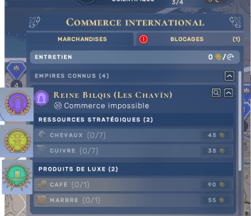
I found the actual panel is annoying (scrolling is meh) to buy resources from other empires. I propose tabs for each empire to display their resources. Buttons on the left side are the tab button for each faction. It only concerns the goods tab, the blockages tab can stay how it is.

- A tab with a resources point of view to quicly know who have the stuff you want and if you can get it with your actual diplomatic status. So you could have 3 tabs, a goods tab (with the resources tabs point of view), a empire tab (showing the resources of the selected empire with the left side tab) and the blockages tab with no change.
Also a resume panel to show what you import and what you export and a filter option to show the trade roads of a specific or mutiple empire to prepare raids and neutralize their economy. If you reduce the initial panel you can put the imports/exports resume panel under


Comments
Moderate comment
Annotate comment